CO-FOUNDEr, VP CREATIVE
STRATEGY 3D PIPELINE ECONOMY DESIGN SYSTEM TESTING
APRIL 2004 - April 2015
WHAT IS IMVU?
MASS SELF EXPRESSION LEADS TO INTENSE PERSONAL RELATIONSHIPS
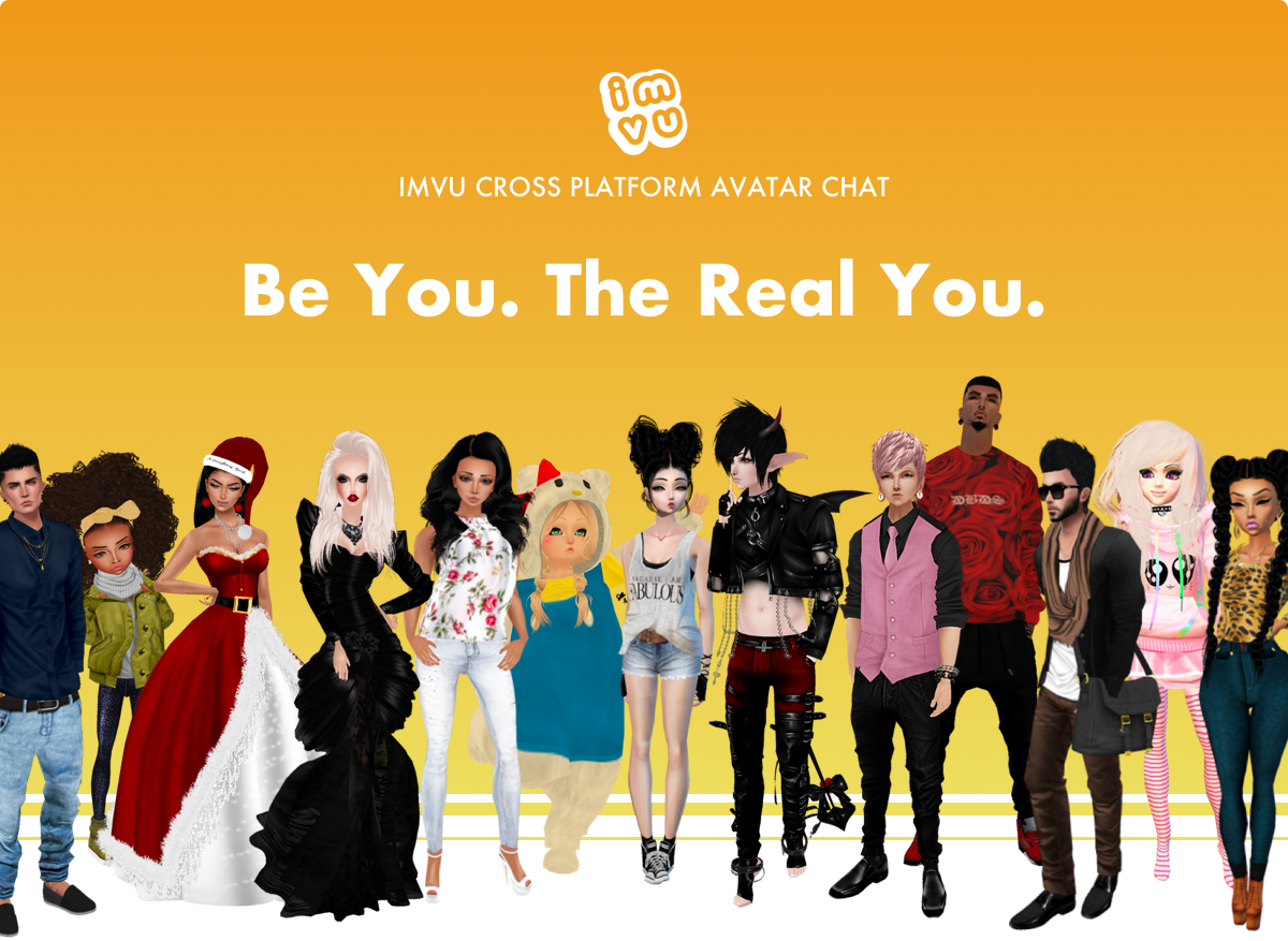
IMVU has staying power! 5mm MAU, +$60mm/year in revenue...and growing! Many of us lack control in our lives and relationships. IMVU gives us the power to control how we are perceived which, in turn, means meeting people based on who they believe they are inside. Avatar-based relationships are often stronger than those started in the real world. Talk about the world's best ice breaker!
IMVU provides 3D avatar chat powered by user generated content. What began as an add on to AIM in 2004 became the world's largest avatar community and virtual goods catalog. It's just amazing that something like IMVU could exist at all, much less become so meaningful to it's users and have such long lasting value.
IMVU began as a reaction to the big company thinking prevalent during the dot com boom & bust: build first and then figure out what people want. From the get go, we set out to become the kind of company that values its customers' opinions above all others...which meant we kinda needed customers right away. Ha! So, in five months, we shipped an ***absolutely, embarrassingly awful*** first product in an attempt to understand the complete product & marketing pipeline.
We learned a lot of the things every new company does when getting something off the ground. However, by prioritizing really listening to users, we uncovered three profound truths.
PROFOUND TRUTHS
- Treating a startup as a series of experiments whose goal is to prove hypotheses as quickly and cheaply as possible is SOOO the way to go. (The method we devised together was memorialized in my cofounder Eric's book The Lean Startup)
- People don't get dressed up to go over to their buddy's house so, if you are trying to sell avatar & environment customization, users must be able to meet, and show off to, new people.
- Across the entire socio-economic spectrum, there are many tens of millions of people in the world who are unhappy with the amount of control they have over their own lives...and that's just counting the signal we had access to (people who happened to have an internet connection.) It's likely more than that! Maybe they don't like aging, responsibility, long term relationships, their income, their position at work, how they are treated by the society around them. Suddenly, IMVU allowed them to try on new, more powerful personas in a safe environment; to explore who they really are inside. What's more, it meant friendships they made within IMVU were based on this new sense of self and, consequently, were much, much closer (ie - real) than most of their real world relationships.
These bonds are inseparable. Marriages have resulted. Children. Communes. Movements. You see, world class avatar systems are the great equalizers. Gender, race, rank, physical state: none of these matter when anyone can be anything. The only thing that truly matters about YOU is how you treat others.
That's some heavy shit.
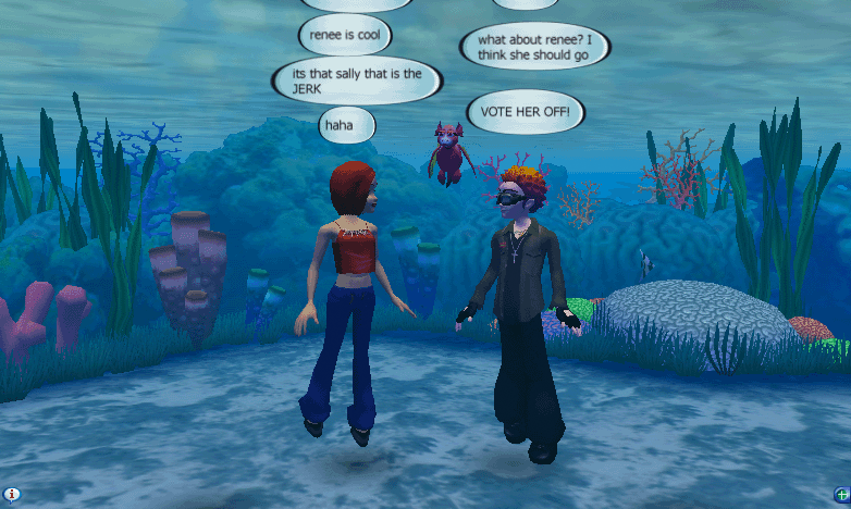
THE INITIAL (ALARMINGLY CONVOLUTED) IMVU ONBOARDING FLOW
Convert an existing, totally fine, 2D conversation to a heavier, laggy, 3D conversation? Nightmare, right? At the time, it's what we thought we needed to do to prove our hypotheses.
MY ROLE
My role evolved to cover what IMVU's creative side needed at the time. As VP Creative, I had 14 direct reports and ran IMVU's next gen tools projects. However, in the early years, my focus was the avatar visual & technical design and the content submission pipeline & economy. Hop over to the Content Creator Program page to learn more.
THE AVATAR
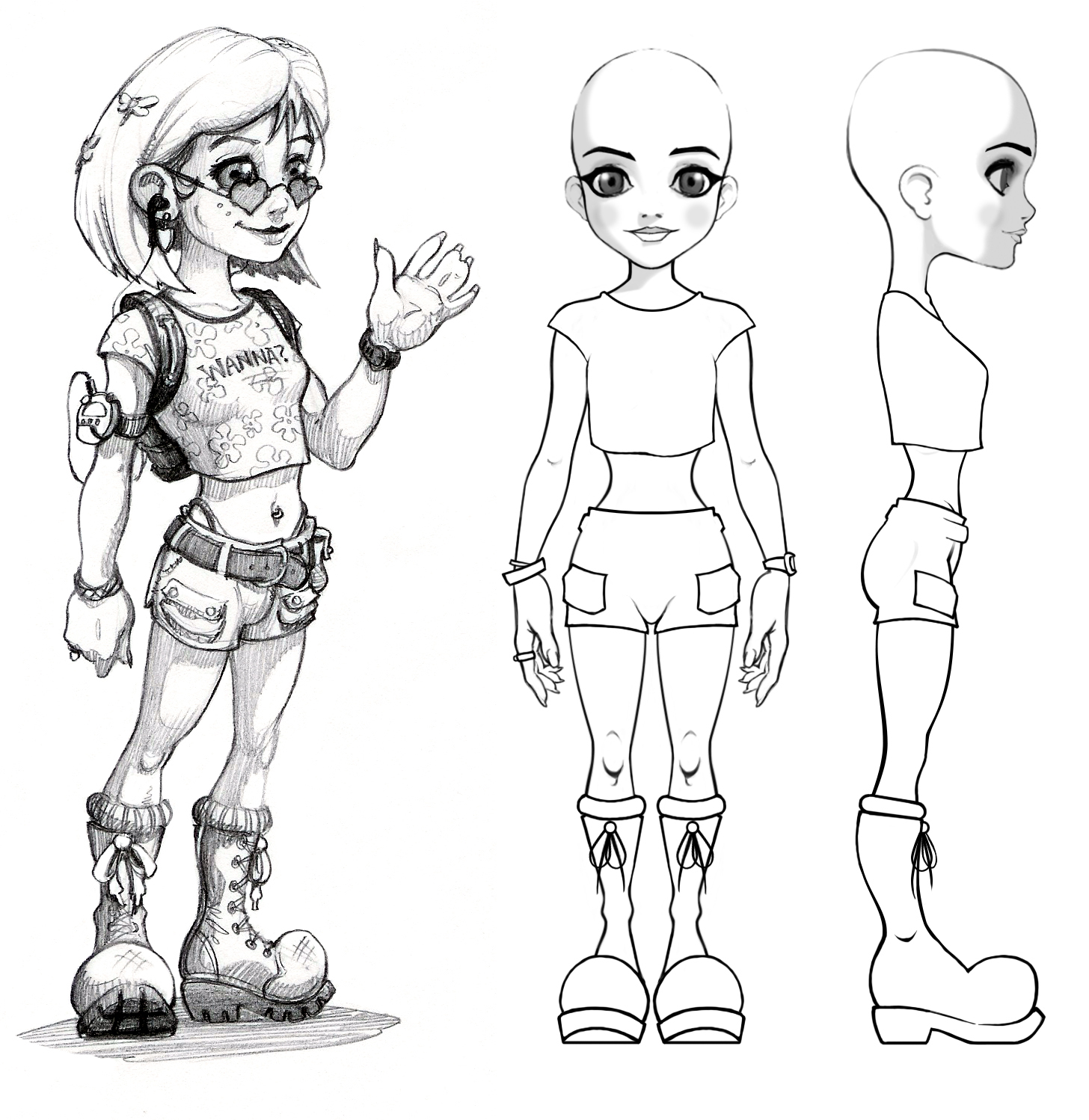
The original avatar was meant to be consumed in a 3x5 inch window. This meant that its facial features and hands needed to be augmented in order to be legible at that size. I took inspiration from Anime proportions of the time as they were solving similar problems. Here are a handful of the earliest sketches I had done.
THE AVATAR PIPELINE
The point of the IMVU avatar, though, was to be the canvas upon which the creative whims of the community could grow. Even though the IMVU product itself went through many, many iterations, the content pipeline we designed in year one remained largely intact through the years.
SIMPLE SKELETON & BODY PARTS
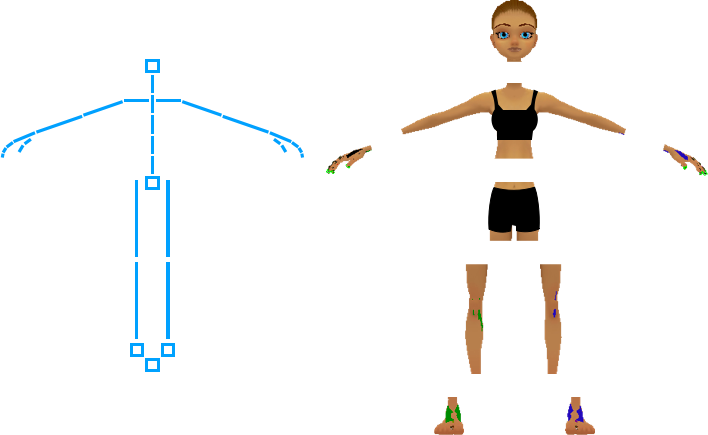
We used one skeleton for both genders in IMVU. This allowed Creators to more easily create skeletal animations.
In particular, it helped with CoOperative Animations as Creators only needed to figure out how one skeleton would interact with itself (vs. the land of super-fun combinatorics that even one more skeleton option introduces.)
FACIAL MORPHS (VS. BONE DRIVEN)
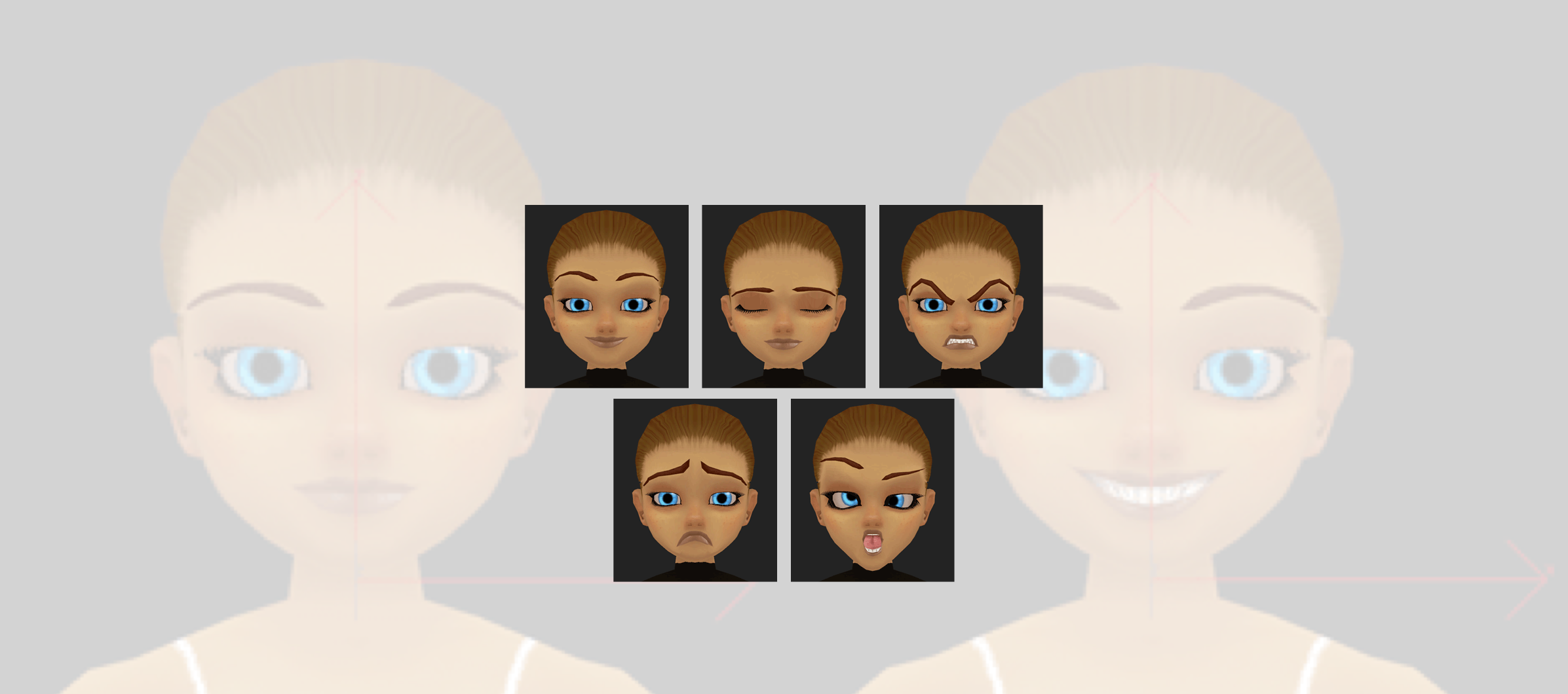
IMVU also made life easier on Creators by leveraging predefined morph targets for facial animation. I built all of the original heads and defined the morph targets . Then, I built all of the facial animations across thousands of animation products using percentages of those targets over time. With that system in place, Creators building new heads only needed to supply properly named morph targets and their head would automatically 'just work'.
SENTIENCE & GAZE
While customization certainly drove the IMVU business, believable avatars fueled the desire to customize. Sentient body movement (shifting poses while standing or sitting) was the foundation but mesmerizing facial animation was the key. We called this system 'Gaze' and it drove both the Head bone and the facial morphs. First, a target is identified, then the eyes attempt to point at that target (triggering a blink animation so the avatar doesn't look shifty-eyed), and finally the head points at that target.
ROOMS
Once we understood the avatar pipeline, we focused on environments. Since editable furniture support wasn't imperative for the first incarnation of IMVU, we made the call early on to have everything built into our environments. We also punted on 3D navigation, favoring hopping from 'seat' to 'seat'. This way, we could test the meat of the idea, the interaction between two people, without the distraction of 3D orientation & UI. This all meant that, contrary to expansive 3D worlds meant for the bold, and so so so lonely, explorer, IMVU was more like a series of connected snow globes that forced its inhabitants to be in close proximity and, hopefully, be more likely to spur conversation. Everything was a set. A model. We called them, "Rooms". Once we proved the core business hypotheses, we added Room decoration to the product and furniture sales exploded.
OK. So, we got off the ground. Check. Now, we had to become a real business.
THE POWER OF USER-CENTERED DESIGN
IMVU's early devotion to Lean methods was a blessing and a curse. While there is no doubt that it helped us learn quickly, we ended up tipping too far into analysis paralysis: many of our efforts became focused on getting better at running experiments vs. listening to the results of those experiments. Also, we didn't know it at the time but our systems for both recording and reporting data were inaccurate and lead us astray. At two years in, this (broken) data-driven approach meant the IMVU product design was a hot mess: we were losing hundreds of thousands of dollars a month and we had less than year of burn. There was internal debate about what to work on next and it looked like we were headed for financial ruin.
This is IMVU from 2007. AOL Instant Messenger-style: Lots of separate chat windows plus tools that were disconnected from those windows.
Eeek! Run away!!! Embarrassing origins.
INTENSE DESIGN SPRINT
My cofounder and design partner, Marcus Gosling, and I had a lot to lose if IMVU went belly up so we decided to do something about it. We assumed that our tech stack would follow a 'correct' design so we attacked the problem from a design perspective. By day three, we had built a prototype (really a series of connected web pages) and started showing it to a mix of @10% existing users and @90% total strangers. The goal was to land a design that made sense to everyone and THEN iterate with paying users to refine the offering. Compared to the rigors of the previous two Lean years, our process was totally un-scientific: if one aspect of a design failed with tester A, we redesigned a fix before tester B. We never tested a failed design twice. We staggered 5 (10, with double booking) tests throughout every day to ensure we maintained pressure to deliver new solutions for the next test. What a SLOG! OMG!!!! hahahaha!!!
We clarified early on that the live product's value proposition wasn't clear and the experience was exhausting. 40 days later, we had a map that 10 out of 10 total strangers in a row understood completely. From sign up to avatar creation & shopping to virtual space exploration, navigation and ownership to meeting people & making new friends: everything was made clear.
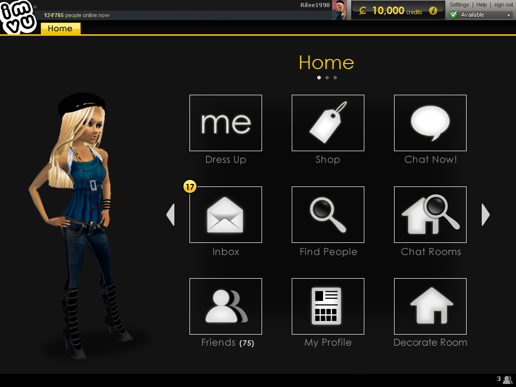
Below is where we landed. A hub & spokes model gave our core Persona the control she craved. Her avatar was now the star of every surface of the app, reinforcing the user's creative decisions, implying that she could change them before conversing with others, and incentivizing her to go show off to new people. A one-window experience with tabbed conversations plus inventory available across all tabs meant user's could have more fun in a focused experience.
From that point, we had to convince the team that we had the answer. Luckily, with just under five hunred usability tests and several dozen paying user validation tests under our belt, that wasn't hard. Once the design was embraced, it was easy to prioritize features into a Minimum Believable Product. A product & customer vision focused our efforts and Boom! Within a few months, IMVU went from losing hundreds of thousands of dollars a month to reliably earning millions.
The key learning for me from this whole process is how important it is to talk to people throughout a product's life cycle to better understand their problems and how to solve them.
CREATORS
My soft spot in the IMVU ecosystem is its Content Creator Program. I like to draw. I like to paint. I like to make things. So, I totally empathize with IMVU's Creators. Hop over to the Content Creator Program page to learn more.

